branding / social media / webdesign
✱.
Calamity Punk Publishing
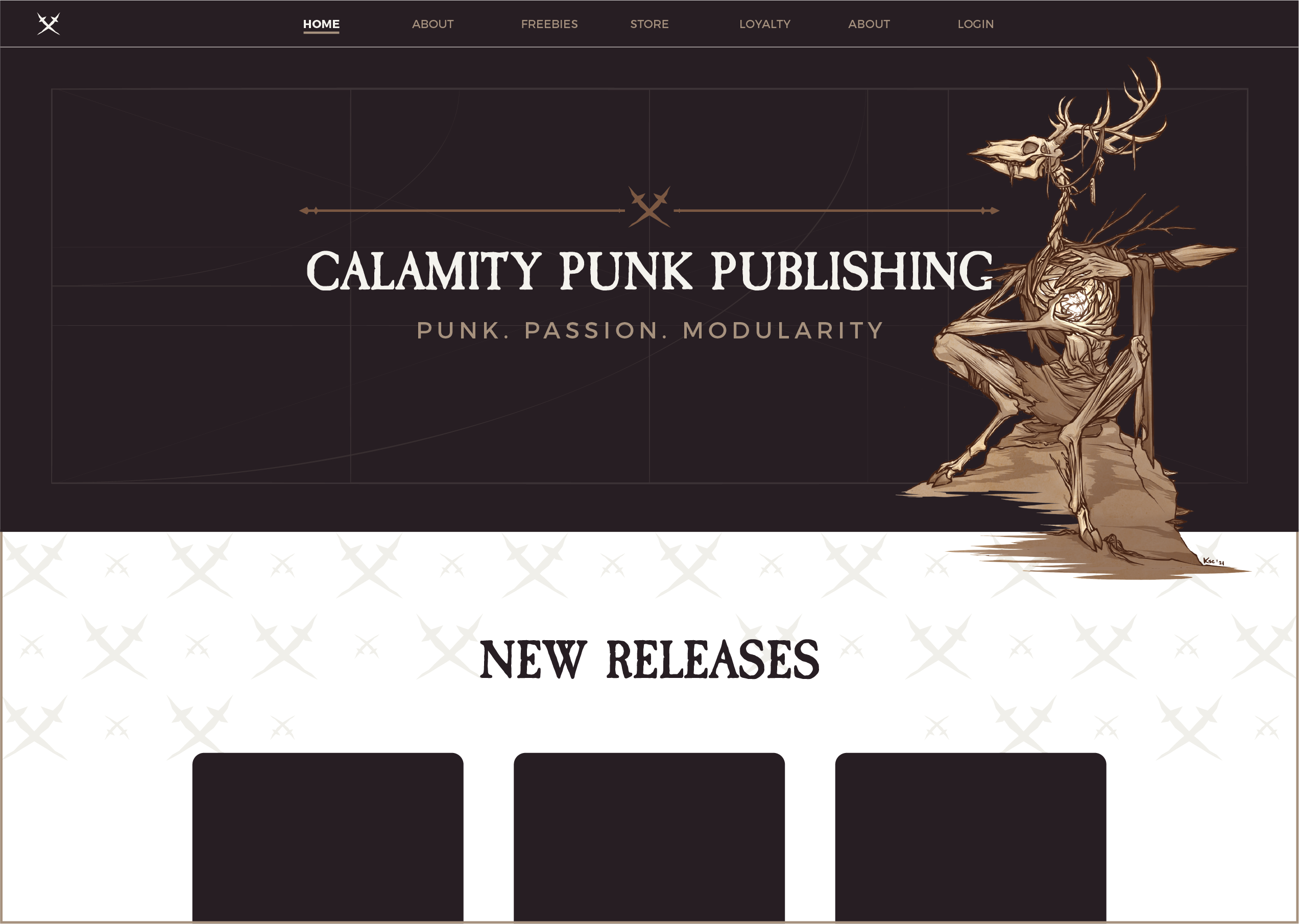
When Mike from CPP approached me to help expand his brand visuals, I was immediately excited about the project! The logo (by Frgstn Designs) & the artwork (by RoninJutsu) looked amazing and absolutely fun to work with, so I got right down to figuring out elements that would go well together with what was already there
the brand mission
01.
Founded by a group of friends and born out of a love for worldbuilding, along with the existing visuals made it clear from the start that the brand statement Punk. Passion. Modularity. would have to be central.
the idea
02.
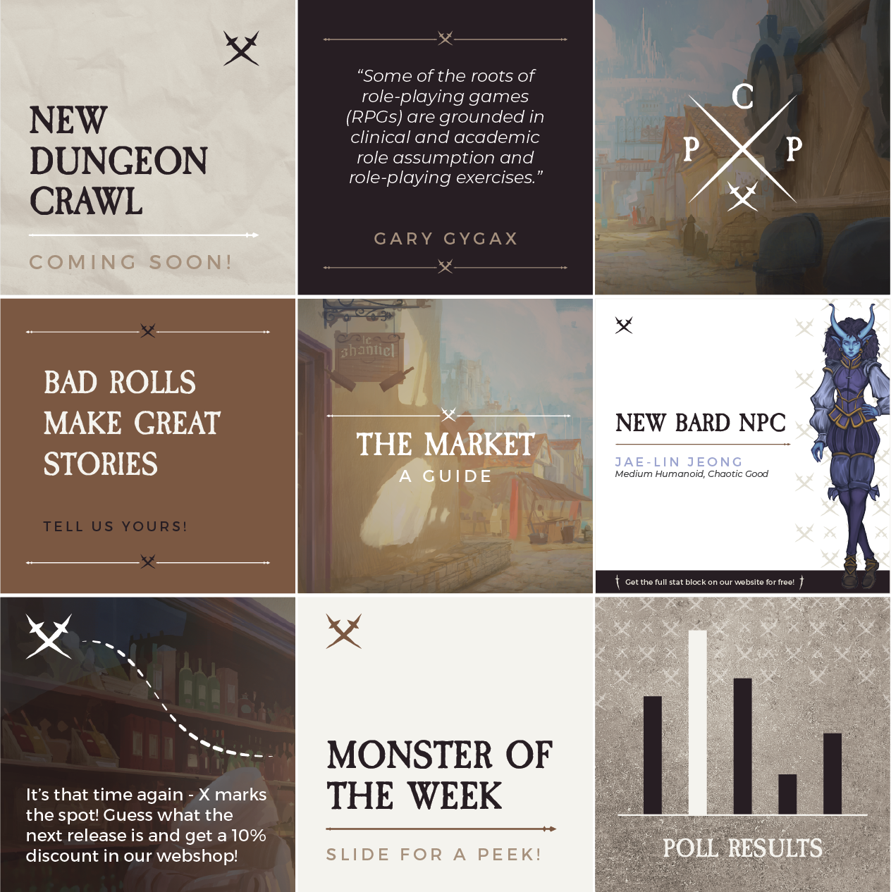
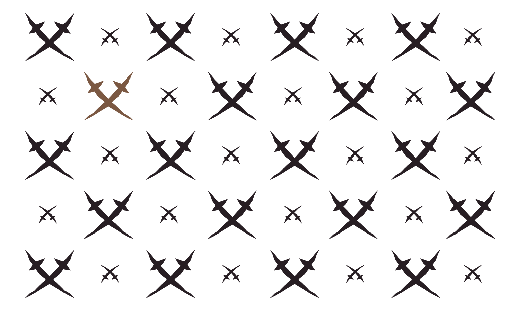
And what’s more punk, passionate and modular than the grunginess of life at sea, transporting goods and adventuring aboard a vessel for the horizon? Does X mark the spot?
typography
03.
Headlines

Body

colors
04.
Main Colors
raisin black
Hex: #281f24
RGB: 40, 31, 36
CMYK: 68, 71, 60, 72
Pantone: Black C
white
Hex: #FFFFFF
RGB: 255, 255, 255
CMYK: 0, 0, 0, 0
Pantone: 000 C
Secondaries
wild brown
Hex: #7A5842
RGB: 122, 88, 66
CMYK: 42, 60, 73, 29
Pantone: 7505 C
tha
Hex: #a5907c
RGB: 164, 144, 124
CMYK: 36, 40, 51, 4
Pantone: 7530 C
white coffee
Hex: #E3DFD4
RGB: 182, 211, 53
CMYK: 10, 9, 15, 0
Closest Pantone: 7527 C
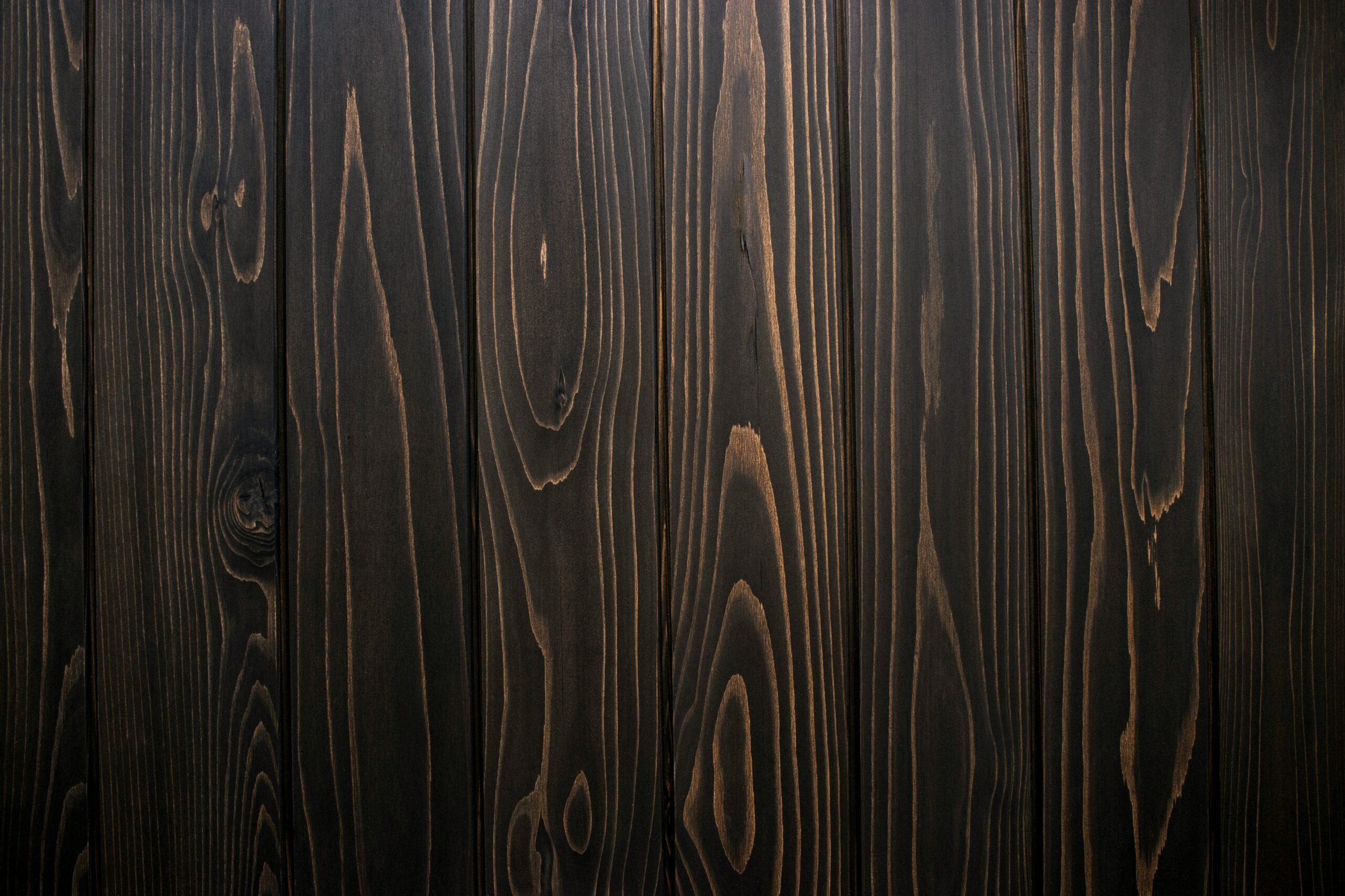
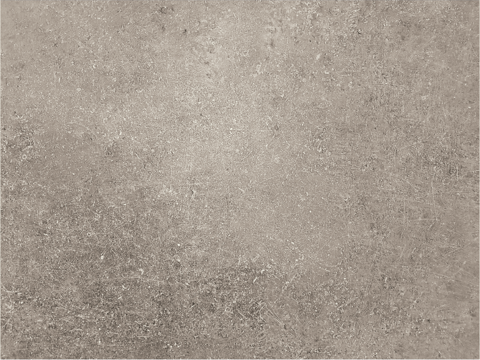
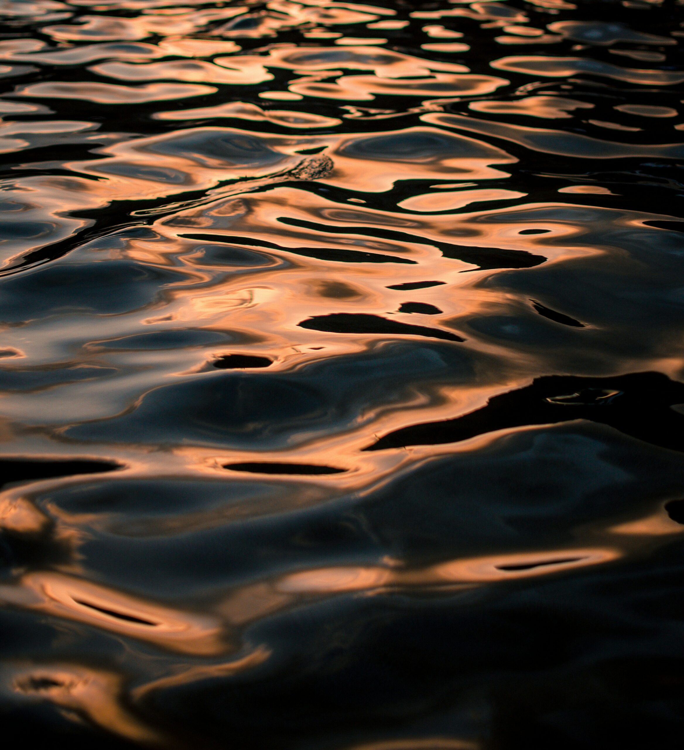
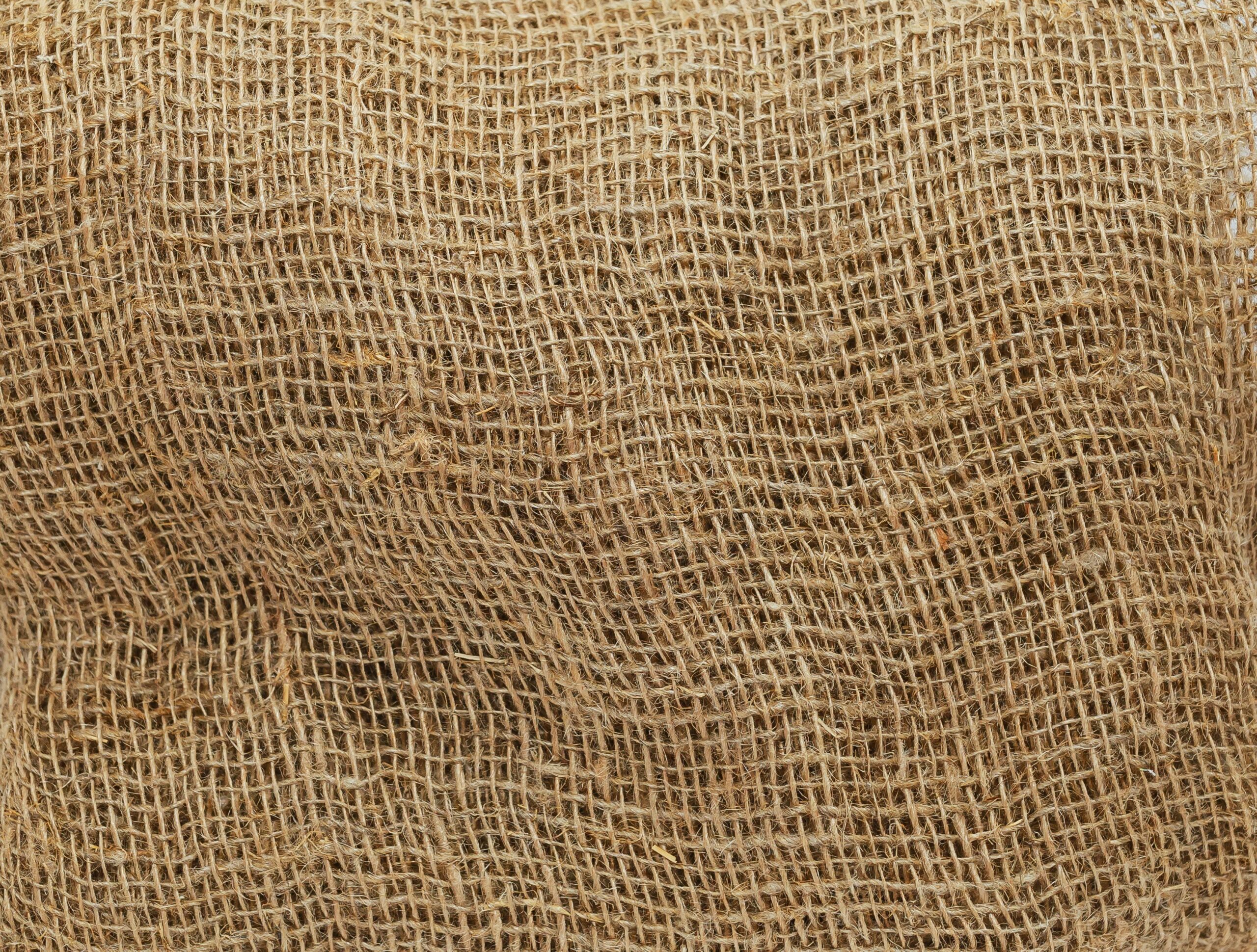
textures
05.
other elements
06.
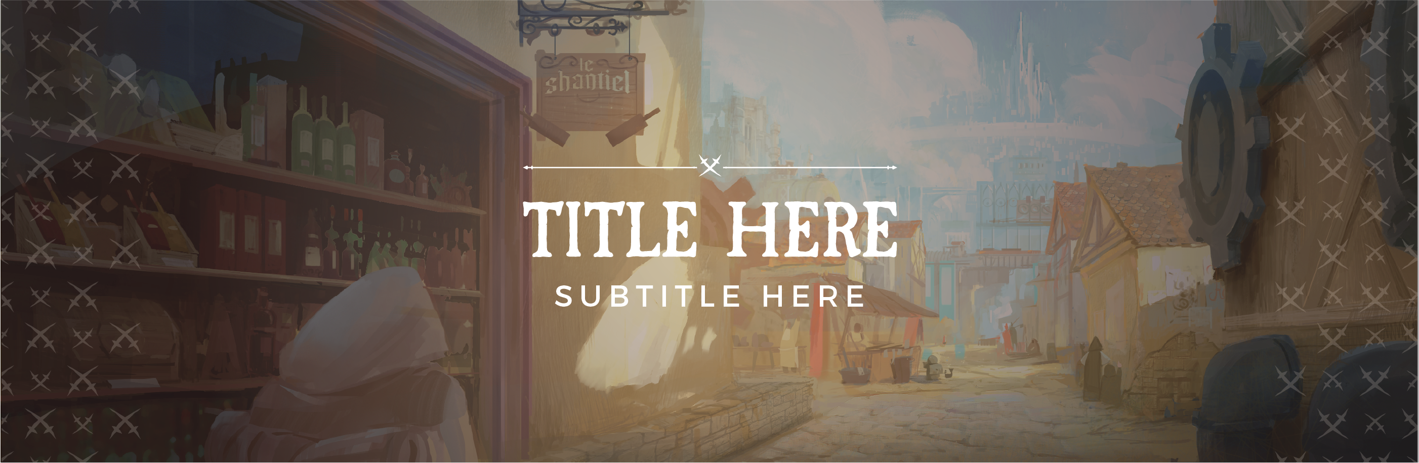
website & social media proposal
07.