
logo & branding / social media / webdesign
✱.
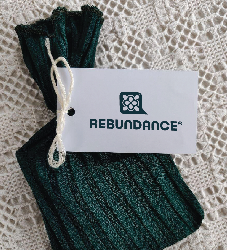
Rebundance
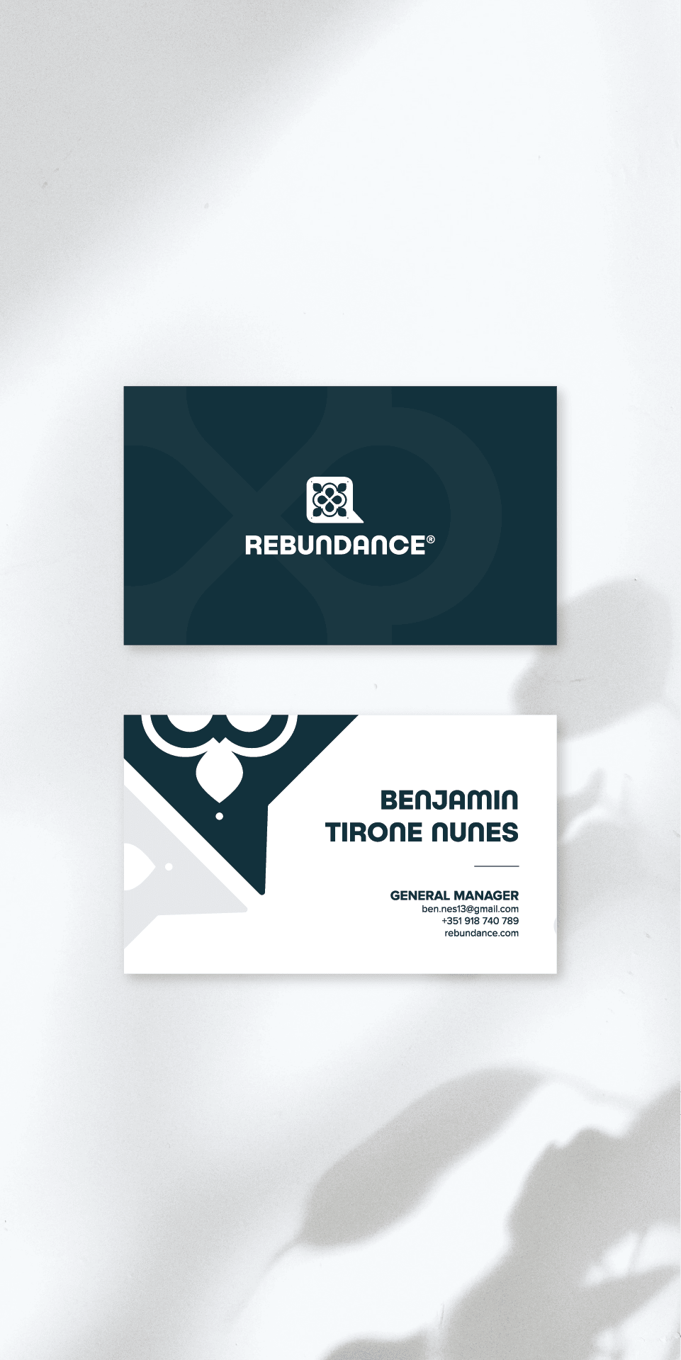
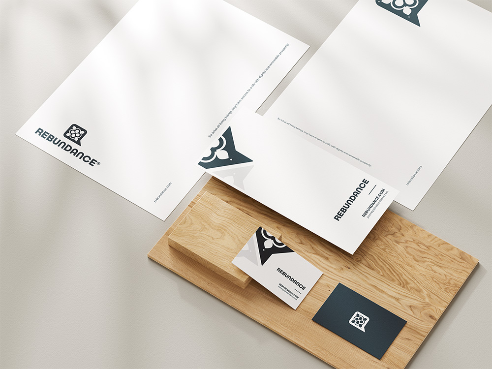
Rebundance is a Lisbon (PT) based brand (owned by Bluecity Lda) that focuses on creating a life with dignity and renewable prosperity for all. Their program offer varies from Leadership Programs with a focus on self-awareness and ones impact on the world, to a variety of programs around our relationship with food, agroforestry and the systems around them. I’ve had the pleasure of working with them for 5 years now, including on their logo & branding.
moodboard & idea
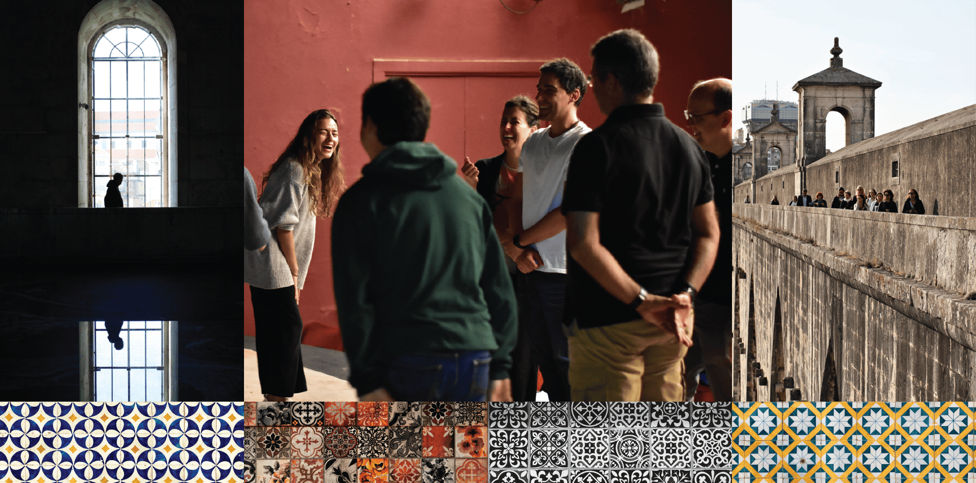
01.
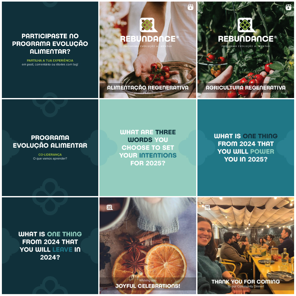
What stuck with me with Rebundance was that no matter the variety of events they facilitate, the consistent outcome of their work is starting conversations, often in spaces where previously there were little to none. With them being based in Portugal and primarily working with local projects, it is important to visually represent this quality.
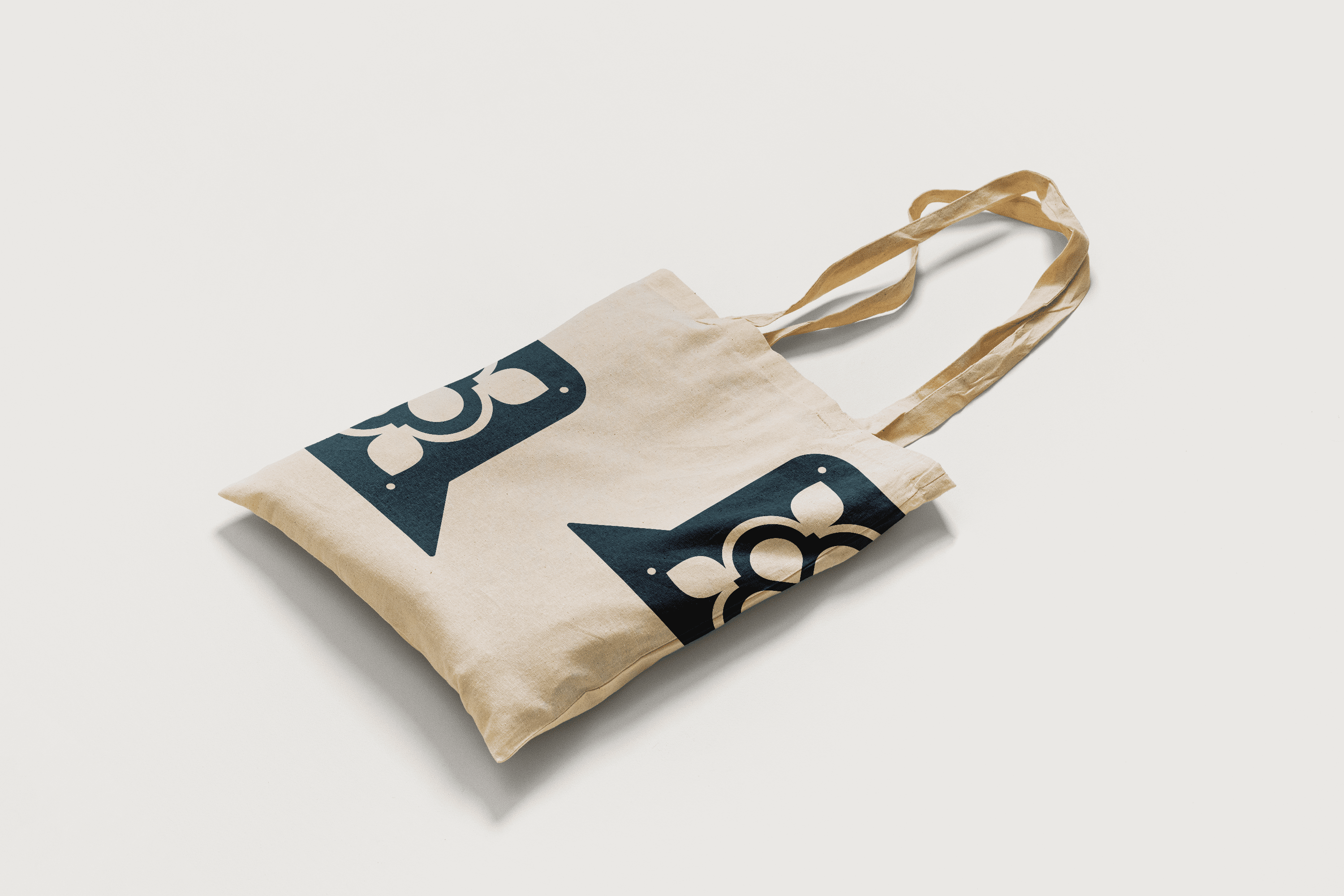
So when the need arose to update the initial wordmark logo and brand colors, I knew I had to incorporate the facilitation of dialogue and local Portuguese ceramic tiles design into it, with the final product’s cut out pattern also representing a glimpse into areas of life that one would perhaps otherwise not grasp.

main logo
02.

typography
03.
Headlines

Body

colors
04.
Main Colors
reb dark teal
Hex: #0F303B
RGB: 15, 48, 59
CMYK: 75, 19, 0, 77
Pantone: 547 C
reb light teal
Hex: #92ccbe
RGB: 146, 204, 190
CMYK: 43, 3, 29 0
Pantone: Green 0921 C
white
Hex: #FFFFFF
RGB: 255, 255, 255
CMYK: 0, 0, 0, 0
Pantone: 000 C
Secondaries
rlp red
Hex: #D14455
RGB: 209, 68, 85
CMYK: 0, 68, 59, 18
Pantone: 198 C
pea green
Hex: #B6D335
RGB: 182, 211, 53
CMYK: 14, 0, 75, 17
Pantone: 583 C
Cof orange
Hex: #ca5727
RGB: 202, 87, 3
CMYK: 15, 78, 100, 4
Pantone: 7583 C
logo variations
05.


usage
06.